script>document.write(unescape("%3Cstyle%20type%3D%22text/css%22%3E%0Abody%20%7B%20background-image%20%3A%20url%28%22http%3A//thecutestblogontheblock.com/backgrounds/Medieval3column.jpg%20%22%29%3B%20background-position%3A%20center%3B%20background-repeat%3A%20no-repeat%3B%20%20background-attachment%20%3A%20fixed%3B%20%7D%0A%3C/style%3E%0A%3Cscript%20type%3D%22text/javascript%22%3E%0Avar%20div%20%3D%20document.createElement%28%27div%27%29%3B%0Adiv.setAttribute%28%27style%27%2C%22position%3A%20absolute%3B%20left%3A%200px%3B%20top%3A%2030px%3B%20z-index%3A%2050%3B%20width%3A%20150px%3B%20height%3A%2045px%3B%22%29%3B%0Adiv.innerHTML%20%3D%20%27%3Ca%20target%3D%22_blank%22%20href%3D%22%20http%3A//www.thecutestblogontheblock.com%22%3E%3Cimg%20border%3D%220%22%20src%3D%22http%3A//www.thecutestblogontheblock.com/images/tag.png%22%3E%3C/a%3E%27%3B%0Adocument.getElementsByTagName%28%27body%27%29.item%280%29.appendChild%28div%29%3B%0A%3C/script%3E"));

Tuesday, March 31, 2009

Traditional vs Contemporary

Welcome, and welcome back if this is not your first visit.

I am doing the first of a three part series on decorating styles at the request of one of my clients and friend.

Traditional Style vs Contemporary Style

This is definitely the shorten version of what makes up the two design styles

A
contemporary home allows you to be comfortable without being cluttered. This style usually starts with neutral colors such as white, black or beige as a base for window treatments, wall coverings, floor covering and upholstered furniture. Punches of color are usually added in accessories to add some drama and flair. (such as a red or orange pillow in textured geometric shapes).

Essentials for contemporary furniture are clean lines, geometric shapes and lack fussy extras. They usually have exposed legs. Bed and chairs have no skirt, trim or tassels.These pieces can be leather in blacks, whites or textured natural fibers. Tables are usually glass and metal as well.

Fabrics often have a natural look found in wool, cotton, linen and silks. Lighting is sleek and streamlined in a metal tones with white or clear glass. Notice very large bold artwork yet sleek and stark furniture with a splash of yellow in the pillows.
( NYC Townhouse)The stuffiness associated with traditional style is no longer, and has been replaced with warm, inviting furniture, fabrics and accessories.
  • The traditional style of decorating is to create rich sumptuous living space using layers of luxurious furniture accessories, and window treatments. The color palettes that are used can be pastels or bold, regal jewel tones such as burgundy and golds. fabrics are usually heavier quality, textured structured draperies with multi layers.
  • Unlike contemporary style traditional uses more wallpaper and the walls are usually highlighted to architectural details such as crown mouldings. (as seen above)
  • Traditional furniture has more of the soft curved lines such as Queen Anne style and are in warm wood tones. Metallic tones in in artwork and framing are key to the traditional look. Artwork on the walls are placed in a more compact manor. Accessories include floral arrangements, baroque style frame work with landscape subject matter, ornate pottery and multiple layers of accessories on tables.
Both styles are beautiful and have their own unique flair. So what is your style? Contemporary, traditional or somewhere in between.
I hope you have enjoyed this segment of design styles. Please let me know what other styles you would like to see.

Monday, March 30, 2009

Met Monday

Met Monday hosted by Susan at Between Naps on the Porch. Be sure to visit Susan and other beautiful met monday posts. My Met Monday is an orchid plant I have that never fails to bloom. I don't know exactly what I do right with this one since I have others that only bloom once and never bloom again but the leaves are great. So here is the plant with the blooms waiting to openHere is the blooms opening. I have these plants in a sunroom off the family room but since we don't use this room much, I decided the plant needed to be moved so we can view the beautiful blooms.I moved the plant to my living room for the spring and Easter season. It had a prominent place on my fireplace hearth.
It looks nice here and we can enjoy the flowers.

Here are the blooms up close and personal. Aren't they beautiful. I did something right with this plant, I just wish I knew what it was.
Have a great Met Monday, oh and did you happen to see my post on Traditional vs Contemporary, take a look around, let me know what you think and don't forget to visit Between Naps on the Porch. This is a great way to see other great decorating ideas.

Thursday, March 26, 2009

Gardening, and visits

Hi everyone and welcome. I am feeling guilty for not posting the last few days. I have been busy with my daughter who is home on spring break and trying to get my vegetable garden tilled so I can plant yummy plants.


I will have a good post real soon. Stay awhile, have a look around, and come back to visit soon. Have a fabulous, blessed day

Expressively
Sofia

Sunday, March 22, 2009

Hi everyone and welcome back to Met Monday hosted by Susan at "Between Naps on the Porch" and " UBP 2009 "hosted by 5 minutes for mom. Don't forget to stop by Susan's blog to see her transformation of her entryway, and 5 minutes for mom to learn about the Ultimate Blog Party 2009.

I have a fairly simple transformation today. My kitchen table is always a dumping ground for just about everything and sometimes I just procrastinate and say "I'll do that later". (sound familiar) Well I could not take it any more .I made a new floral arrangement with flowers I already owned and reinvented the container it is in. I also used some spring cloth napkins to make a tablerunner down the center of this some what dated oak table. Here it is-YIPPIE!

I had yellow tulips, red geraniums, and white accents flowers.
I had these pears so I hid some in the arrangement.
Here is a close up of the tulips and yellow daisies I also had.


Just another view including the napkins and a clean table. Ah how nice it is!


The container had been used as a fruit bowl on my kitchen Island with fresh fruit.


So now I have this lovely fresh fruit bowl that had been used for the artificial pears.
Re purposing is always a good idea.


If you are tired of looking at the cluttered counter or kitchen table, take an hour of your time. Look around the house and in your silk flower stash, organize the smallest area and add a decorative item. You will be so happy you did.! This small transformation makes me smile, whenever I walk into the kitchen, instead of looking at the dreadful pile of papers that I just could not get myself to deal with.
Expressively, Sofia

Saturday, March 21, 2009

March 20, 2009

The Ultimate Blog Party 09

ubg1

HAPPY SPRING EVERYONE AND Welcome! If you are stopping by from the Ultimate Blog party, I hope you’ll stay a few minutes and look around.

I’m am right now from California but was born and raised in New York (Long Island that is!) and I love a great party (good clean fun!). I am new to the blogging world and hope I would make a few new friends from the party. I also love to decorate, so I hope you will take a look around for a few minutes and view my posts. Even though I am new at blogging, I am always try to create a new decorating project and would love to meet new friends.

5 Minutes For Moms is a very popular site that hosts a blog party every year and it has just started today. The blog party will run for a full week and it sounds like there will be lots of prizes, lots of fun, and it’s a great way to meet other bloggers that you might not normally visit or meet. Just click on the party picture for more information on how you can win fabulous prizes and get in on the fun.

I hope I win a prize! I would be happy with #19, 21, 89 , 92, 123, 91, 50, or Intl #14, 15 29 33, 34, or USC #40. It will be fun to anticipate which one I would win

So, if you would like to get in on the party, just click on the links above and go check it out yourself. These girls do this blog party as a way to encourage blog friendships and meet others, this is a perfect opportunity to do that. You don’t have to donate a prize to win. Read all the rules and be sure you sign the party post with a comment, then do your own post so others can find your blog, add yourself to Mr. Linky and be ready to have some fun this next week, while meeting new friends! Let the party begin!


Thursday, March 19, 2009

Life Makeover

Life Makeover

There are many reasons to write about myself for a life makeover ,but I would this be about a dear friend of mine Denise Kofford, who in the last two years has lost both her parents, moved away from all of her friends because of her husband’s job and is trying to make the most of everyday. She is now trying to take care of her parent’s estate, run a scholarship in their memory, and will have to sell her parents home.

She is trying to find who she is inside. Outside she is a beautiful person full of life and vitality. She worries about so many things in life, such as raising her children right, ensuring her home beautiful enough, and sometimes I think she fills her time with just too many items and puts herself on overload. I know she asks God for guidance every day.

So I would love to see the makeover, (although I would love to have suggestions about being successful in the business world, being more computer literate, and economically sound), go to Denise. She loves listening to advice from others now that her parents are gone. She sometimes feels alone and would like to have her friends from CA come to visit more often. I would love to see her find a balance between family life, activities, and time to relax. It would be very exciting to honor a life makeover to my friend Denise. I feel she really deserves it.

Wednesday, March 18, 2009

Tablescape Thursday

My Tablescape Thursday a birthday pastry recipe for my dad and the feast of St. Joseph and a Pottery Barn tablescape.
Zeppole Di San Guiseppe
1/2 cup butter dash salt 4 eggs beaten
1 cup water
1 cup flour
1 tablespoon of sugar
1/2 teaspoon of orange rind
1/2 teaspoon of lemon rind
1 quart of vegetable oil

Combine butter, salt, and water in saucepan and bring to a boil. add flour all at one time and mix well until dough leaves the sides of the saucepan. Remove from stove and cool a little. Using electric mixer and dough hook, add eggs one at a time mixing well with each addition. add sugar, orange peel, lemon peel and mix thoroughly.
Should look like this:


Heat oil in a large pot so dough can move around as show above. Oil is ready when dough dropped in rises to the top of the saucepan. Drop by tablespoonfuls into heated oil. Dough will start to pop and turn around on its own. (this is how you know the dough is right). When dough floats and turns and is golden brown remove and drain. Continue this until all dough is used. Use your favorite pudding to fill with and generously sprinkle with powdered sugar as the dough is not sweet. Enjoy!


I saw this tablescape at Pottery Barn and just had to share it with you. That dinnerware is so light and bright and the colors are so vibrant. I just loved it!
To also confess I just lost track of time because I made a pastry for St. Joseph's day 3/19/09. I will share this recipe with you above. It is so yummy!

Be sure to visit our host Between Naps on the Porch for more exciting tablescapes.

Thank you for visiting! Have a fabulous day.
Expressively Sofia


Spring Fluffing!

Sorry for the delayed post. Spent St. Patty's Day with my family. Thank you to Southern Hospitality for hosting a Spring Fluffing. Don't forget to go to "Southern Hospitality" to view more beautiful spring beauties.


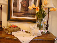
Tulips are a sure sign of Spring time!


East eggs and bunnies help put us in the upcoming Easter season mood.
This egg garland was purchased at Pottery Barn two years ago.


Little touches of spring in a potpourri bowl. I have
repurposed some of my decor and just added spring elements to them.


Easter egg candles purchased also at Pottery Barn just last week. $10.00 for six
You can use the as
votives in a votive holder or as place card holders for your table scape at you dining table.

I love tulips and bunnies for spring as is evident at this table.


Here is my entry table All done up in its new Spring attire!
I hope you have enjoyed my Spring Fluffing and encourage you to visit "Southern Hospitality" to see much more!
Expressively Sofia
Have a great day!


Monday, March 16, 2009

I am involved in a new site called, "Project Create A Home"


developed by Meme of "Screaming Meme." Meme has gathered a group of ladies who will contribute life and style tips to readers on topics ranging from finances, decorating, fashion, organzing, health, fitness, etc...It's an exciting site and today is the "Grand Opening!" There is a special giveaway today where one lucky reader will receive a life and style makeover.

Think "life coach" rolled into one giveaway! Many of the contributing writers are also doing giveaways, so be sure to stop by and enter! You can find me there from time to time submitting articles as well.

Have a great week, and let's win! :-)

Sunday, March 15, 2009

Met Monday Bathroom renovation

Welcome to Met Monday hosted by "Between Naps on the Porch" be sure to visit this site for many more decoration transformations.
This Metamorphosis is my hall bathroom that my children have used for 10 years. Unfortunately my old pictures of this bathroom are on non digital photos. So this is the overhaul we gave the bathroom. We had oak cabinets and sponge painted walls. The counter had been cultured marble that had lost its finish. We chose to use a six" ceramic tile for the counter tops with a tumbled marble decorative back splash. We carried this decorative item over to the shower. My husband and I did all the work ourselves which was very time consuming, a lot of fun and very rewarding.

Here you can sneak a peek at the sponge painted walls (below). We changed the shower fixtures and raised the shower head up 6" to accommodate my son who is 6 ft.. We did keep the existing tub as it is white and was in great shape.

We had a linoleum floor (does anyone else have them!) in that room which we changed out.

So here is the reveal of the beautiful work my husband did on the tiling. This is the border in the shower.

We chose oil rubbed bronzed fixtures in this room. The shower door is clear so you can see the beautiful tiles, shelf fixtures.

The cabinets also received a face lift. They were primed and painted with an off white paint and treated with a mocha glaze to give the old world look. We changed out the full width mirror with this beauty found at Marshall's for $24.99. I purchased two one for each sink. Yes there is a second vanity in this room


Here it is. The second vanity. We debated about excluding this sink all together and thought it would be better for resale to keep it.


The walls are Benjamin Moore Warm Cognac. Sounds so yummy and looks so warm and inviting.


Some decorative items I found. This was originally painted a green patina. I needed it to be oil rubbed bronze, sooo out came the espresso spray paint with a copper overlay.... oil rubbed bronze there you have it.


The linoleum went out and the 20" tile floor with another decorative feature carried from the shower and back splash to the floor.


My husband also decided to try his handy work with crown moulding. He did a fabulous job.
We also decided to keep the medicine cabinet for practical reasons.

My tip for today: Don't be afraid to use big tile even in a small room. It make the room appear more expansive and you have less grout lines. Also you can mix your tile elements ceramic and natural together. As long as the color tones go together.

Thanks for visiting today and be sure to visit other Met Mondays changes here at Between Naps on the Porch

Sunday, March 8, 2009

Laura's Bedroom


My daughter Laura came home from college and asked me to make her room over from the High School teenage years to the more sophisticated college years. She asked for her room to be black and tan/gold. " Not to many flowers Mom" she added. So I set out to try and make her dreamy bedroom come true. I know the above picture does not give you much idea of what the room was like but the room was ocean blue with tropical prints all over the walls. She had a twin bed with a blue and white Pottery Barn tropical toile print. There was a netting over the twin bed that covered the bed. She had a oak dresser in her room and lots of clutter.
Above is her room all done. The comforter set came from JC Penney American Living collection. I also bought the matching valance. (picture to come). I found the two white dresser's at a model home clearing sale for $75.00 for the two. (Wow what a deal). I painted the white bookcase black. Found the three extra pillows at a consignment shop for $45 for the three. We had the Paris from her dorm room her sophomore year. She also went to London and Paris so she brought home a few prints. The friends picture frame was a gift.


She stills loves the tropical look so some of the prints are tropical but in sepia tones. All the prints in the room are either sepia tones or black and white. The walls are painted in Benjamin Moore Aura C: Turmeric.

Tip: When redesigning a daughter or son's room keep in mind whatever the age you will be redesigning the room at least three different ways from the time they are one yr old until they are 21st birthday. I have redesigned Laura's room four different ways since her 3rd birthday. Paint is an easy way to change any room, window treatments and comforter in the age appropriate style and print will help to complete the look. Use ready made treatments since you will be redesigning many times, this is more cost effective. Have fun and remember to try to please your child, they are only young for a short while, it is only temporary and in the blink of an eye they will be full grown and on their own!

Thanks for stopping by today!

Expressively Sofia